
Role
UX Designer, collaboratively with the entire UX team
Timeline
January 2020-2022
Client
National Geographic Society
Tools & Platforms
Figma, Storybook, Bootstrap
▎B A C K G R O U N D ▎
The Value of a Design System
The design industry is constantly evolving, and having an organized system in place to deliver rapid design is key to having consistently great UX. A design system allows a team to build better products, faster. Designers can focus on what’s important – the user – without getting lost in the details of building components.
Using the Atomic Design Methodology
In it’s most basic form, a design system is a series of ready-to-use components that are flexible and reusable. A healthy design system functions similarly to a complex organism. It can mold and shape itself to fit a variety of needs.
The UX team as National Geographic often referenced Brad’s Frost’s atomic design methodology while building the design system.
“Atomic design is a methodology which isn’t about designing a single instance or page, it’s about designing with the big picture in mind — it’s about designing the core of the system.” – Brad Frost, Atomic Design
Our goal was to design atoms that seamlessly fit within molecules and organisms so users had a cohesive, consistent experience throughout all of National Geographic’s products.
▎T H E P R O C E S S ▎
Step 1: Conducting a UI Audit
To help prevent creating repetitive components with similar functions, we decided to conduct a UI audit of all the components, typefaces, and colors that existed in every National Geographic product.
Identifying Broken or Missing Components
Some components that existed were functional, but weren’t the best user experience for our users. There were also situations where a product needed a component that didn’t exist. We wanted to make our library as future-proof as possible, and included those missing items in our audit spreadsheet as necessary future components.
Step 2: Creating Components
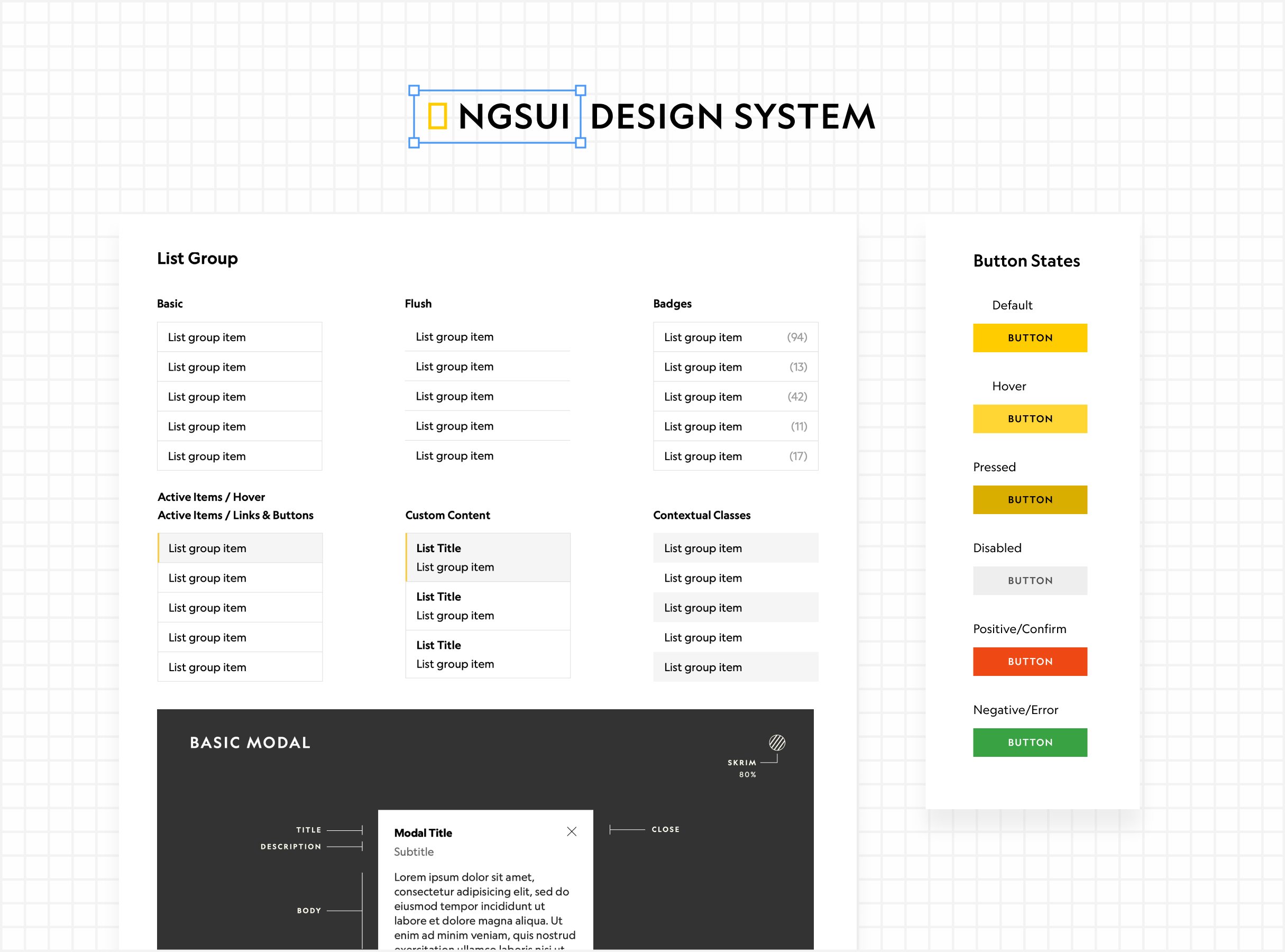
Our team decided to use Bootstrap as the foundation of our design system. Bootstrap is a fully responsive framework with components that closely mirrored the components we listed in our UI audit.
We used Storybook for both the developers and designers as our main tool for QAing and testing. The design team used Storybook to see if the components created by the devs was consistent with the design system.
Step 3: Accessibility
National Geographic’s goal with our new design system was to be WCAG 2.1 AA compliant. We checked colors, content, navigation, and more against the requirements.
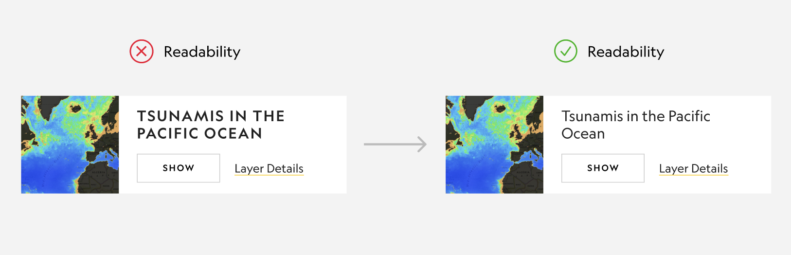
One area I found users struggled with accessibility was our text styling. National Geographic’s style guide incorporates all caps text using their Geograph Edit font. While all caps is a great stylistic option, it becomes detrimental when used to convey larger chunks of information or important microcopy.
Styling the word “CLICK” in all caps isn’t an issue for users, but if you use a longer word, such as “DOCUMENTATION” it becomes much less readable. Readability is reduced with all caps because the letters all have a uniform shape, meaning users can’t identify letters as quickly by their shape.
We decided to limit all cap styling to button microcopy, and shorter pieces of content, like labels.
Step 4: Documentation
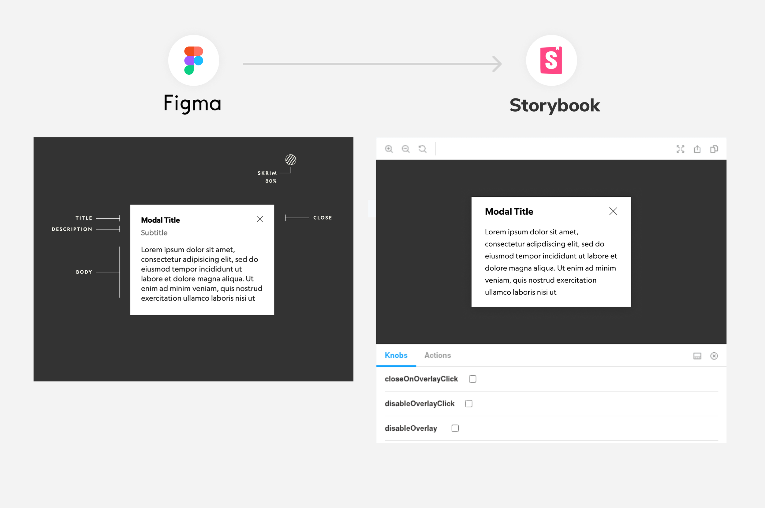
To help designers and developers work hand in hand, Figma and Storybook pages were created to be 1:1. The list of pages in Figma was organized in the same order as the list of pages in Storybook. Similarly, a component’s variants in Figma reflected the same knob options in Storybook.
This became a huge timesaver during a design’s handoff process. If a designer needed to update a component for their design, they could explore what variations were available for that component without a developer needing to build additional functionality from scratch. This also made the implementation process a lot faster for developers.