
Role
UX Designer
Timeline
January 2020-2022
Client
National Geographic Society
▎O V E R V I E W ▎
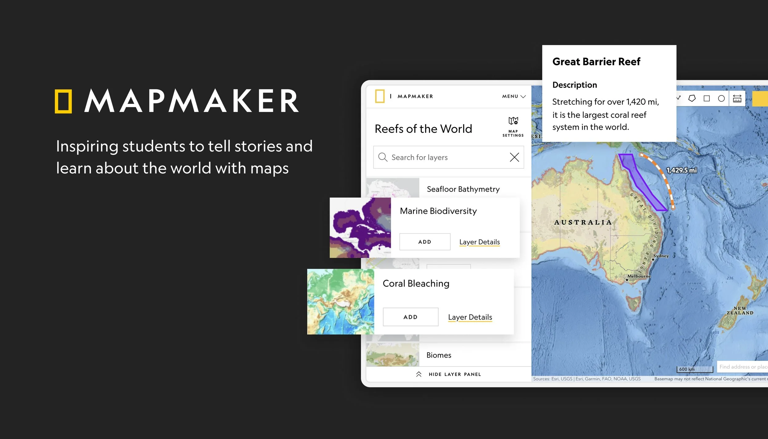
A New Way to Teach and Learn with Maps
“MapMaker delivers a creative new approach to teaching with maps that inspires students and develops their knowledge of the world.” – Esri
▎B A C K G R O U N D ▎
Storytelling with Maps
Maps have the ability to create relevance and spark genuine personal connections in all levels of learners. Educators love using maps in their classroom because they promote critical thinking, foster creativity, and allow students to expand their view of the world.
National Geographic brings three unique value propositions to K-12 education tools: their learning framework, Explorer content, and world-renowned expertise in maps.
The Problem: Reimagining an Outdated Tool
The old MapMaker needed a refresh. The tool was outdated, unintuitive, and broken. Users often complained of broken features, difficulty onboarding students to the tool, and no content that related back to lesson plans. They wanted to take advantage of National Geographic’s Explorer-led content, but couldn’t rationalize wasting an entire class period teaching students how to use MapMaker.
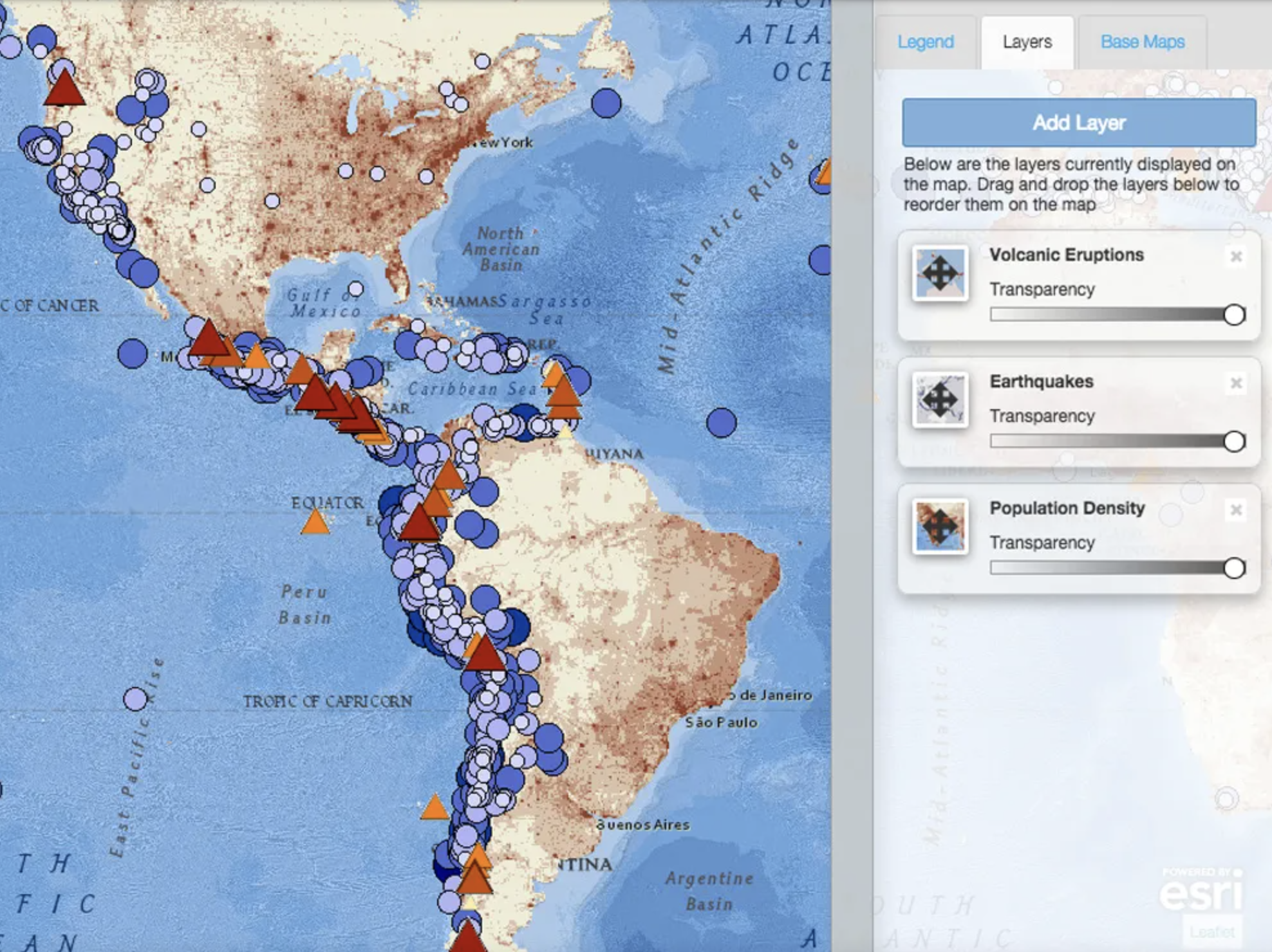
A screenshot of the old MapMaker Interactive tool.
▎D I S C O V E R Y P R O C E S S ▎
Validating Old User Research
The first step in my process was to review, validate, and organize all the previously gathered research. The old MapMaker was passively collecting feedback using CSAT surveys from users interested in helping to improve the product. I analyzed and coded the feedback using Airtable, then reached out to users who provided their contact information to schedule follow-up interviews and dive deeper into some of the pain points they described.
I asked Educators questions like:
How are you currently using interactive or static maps in your classroom?
Can you walk me through a lesson you created that involves a map?
What difficulties are you running into using maps in your classroom?
Identifying Common Themes
Theme 1: Kid-Friendly Storytelling with Maps
Educators want to introduce students to GIS, but it takes too long to onboard kids to complex storytelling tools like Esri during class time. They need a tool that is simple enough for kids to use, but still has the power to visualize complex data sets.
Theme 2: Online Collaboration
Educators want the ability to save and share a map with their students. Teaching kids to create emails, passwords, and then sign-up for a tool takes too long during class time, and often requires parents to sign waivers about sharing data online.
Theme 3: A Cohesive Learning Framework
Educators want access to National Geographic’s learning framework and content, but struggle to find the right resources. National Geographic’s content is disorganized and lacks cohesion, which makes it difficult for educators to discover resources that relate to their lessons.
▎R E S E A R C H & D E S I G N ▎
Theme 1:
Kid-Friendly Storytelling with Maps
To help improve the storytelling experience and make it more age appropriate, I decided to do a round of usability testing of Esri’s mapping platform in MapMaker. All of the storytelling functionality was provided by Esri, and I needed to see where users were struggling with it.
High-Level Heuristic Evaluation
I first completed a quick heuristic evaluation on Esri’s Sketch tool that would hopefully power MapMaker’s drawing tools to gauge how viable the widget was.

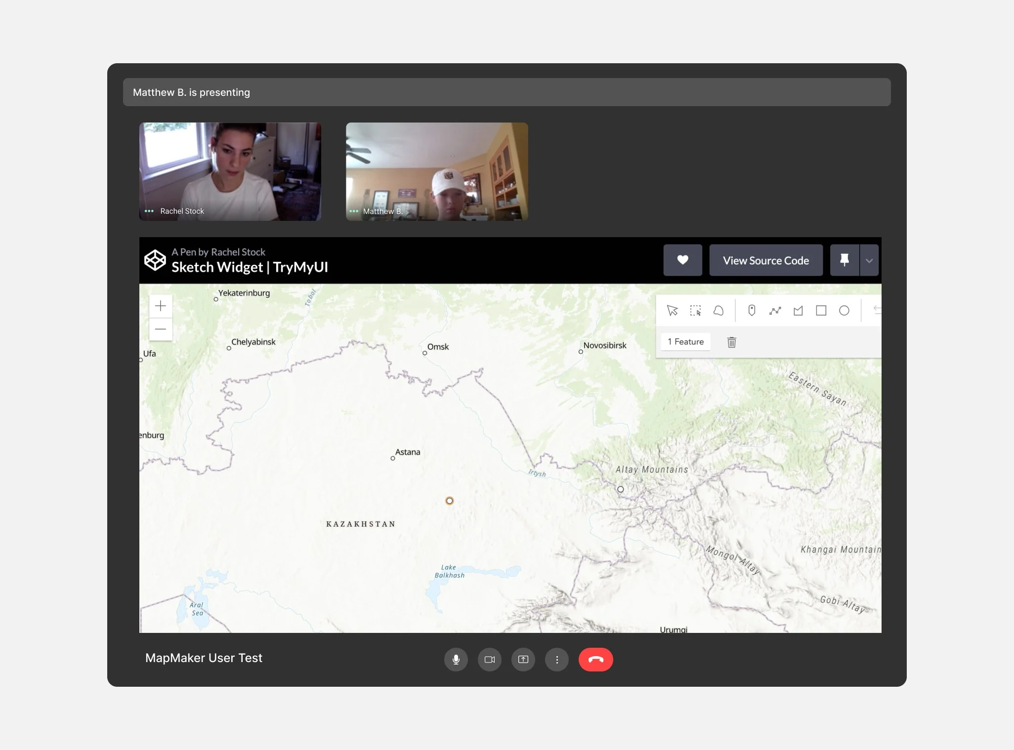
In-Depth Usability Testing in CodePen
Traditionally, the first round of usability testing is done with a prototype. However, Figma’s prototyping tool was too limited for what I wanted to test out. How could I test if students can drag and drop a point easily with a flattened image of a map in Figma?
Enter Codepen. Esri has a sandbox of all their widgets available to the public, so I copied the code for their Sketch widget and inserted it into CodePen. This quickly gave me my own sandbox for users to go into and test out tools without needing devs to build me an environment first.
I asked 10 students a variety of drawing-related questions:
Can you add a point to North America?
Can you draw a rectangle around Colorado?
Can you delete your rectangle and point?
If you had a magic wand and could add anything you wanted to the map, what would you include? ✨
Testing Results: Adding Tooltips, Color, and More
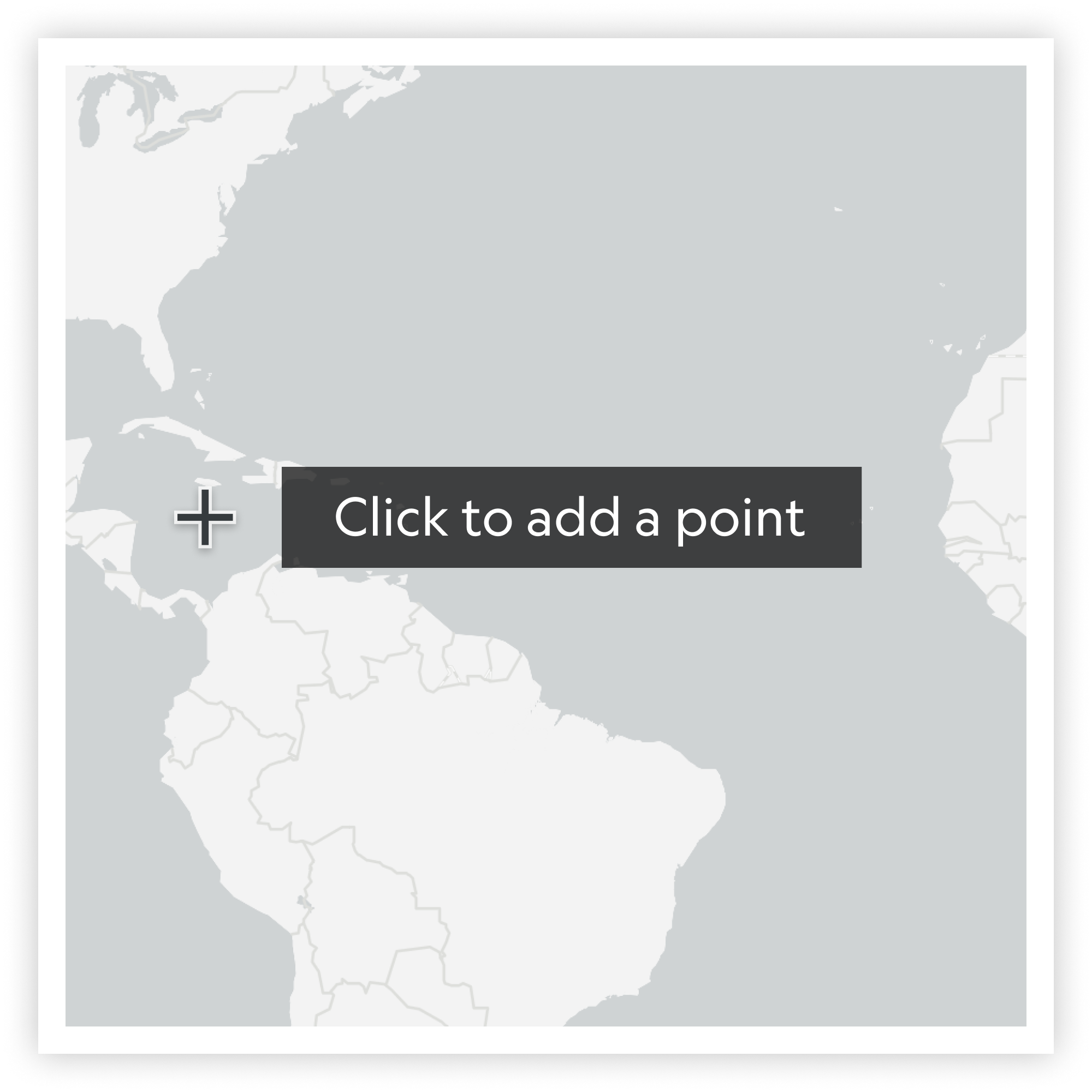
Adding Tooltips to the Cursor
Only 2/10 users were able to add a point without direction, so I added tooltips to give users clear guidance on how to add a point.
I also included tooltips in the mobile view ↗
Relocating the Delete button
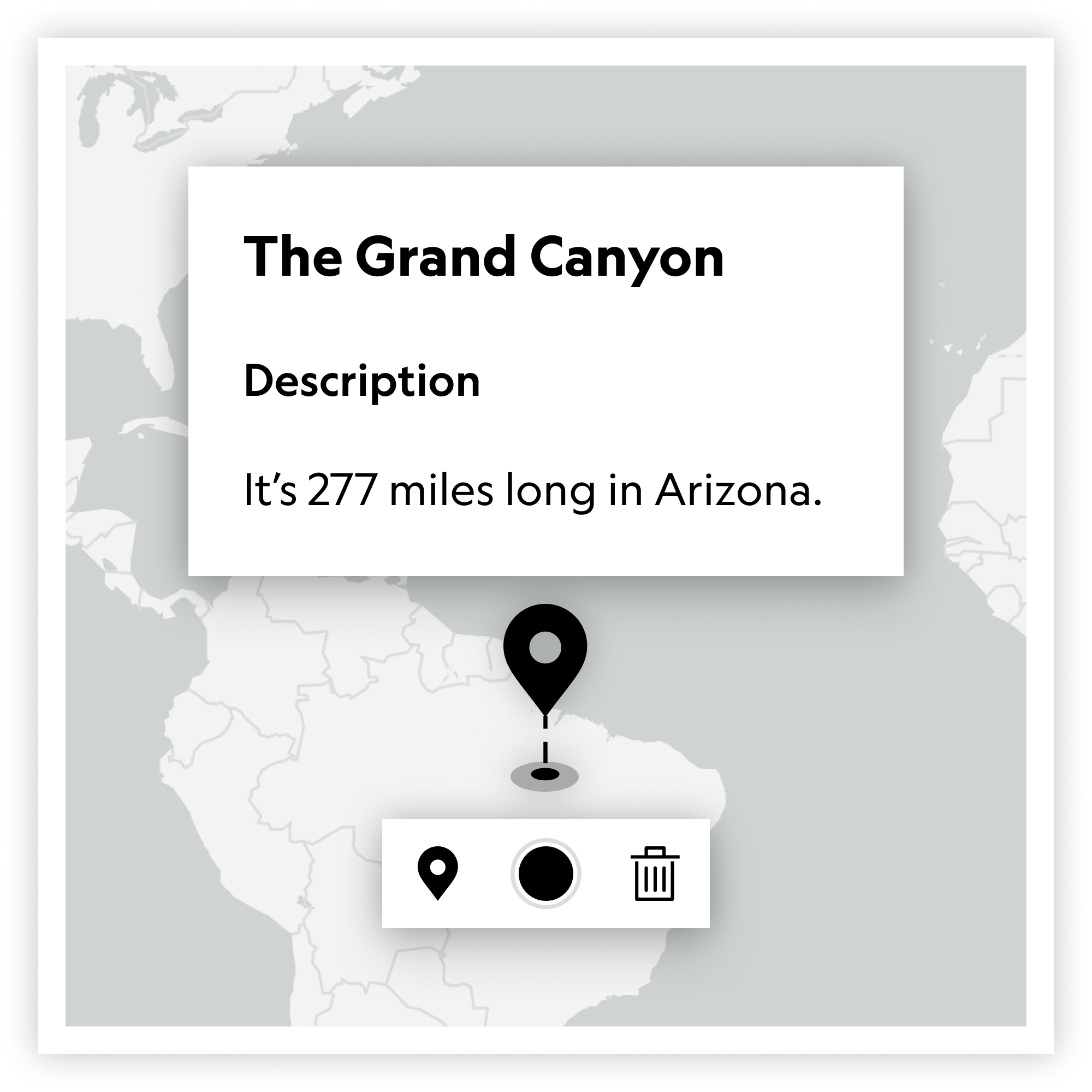
Users often struggled to find the delete button. I relocated all functionality related to the selected item to be directly below it.
Follow-up Usability Tests
As the overall design of MapMaker progressed, I scheduled follow-up tests with students to continue iterating on the overall design of MapMaker. A few usability testing sessions highlighted a need to re-design the layer panel. Students struggled to adequately use the layer panel to analyze information on the map. They didn’t recognize how to use core functionality, such as turning a layer on and off, which was a big problem.
To help find a new way of designing the UI of the layer panel, I reached out to my design team and facilitated a Silly 6’s session to explore new options.
Adding more Storytelling Features
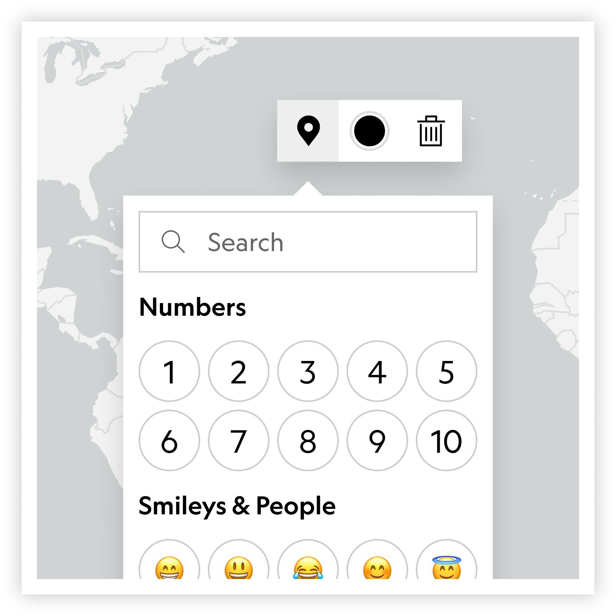
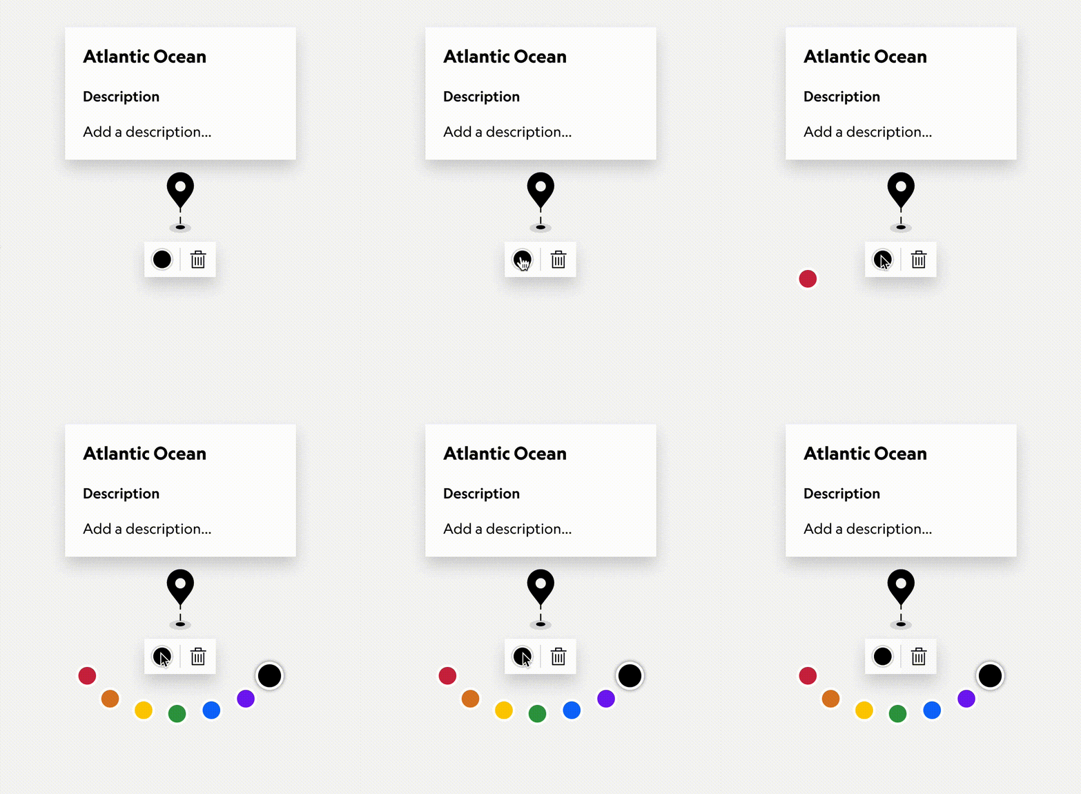
Users often asked if they could change the color of items and add emojis. I updated the functionality to include options for adding colors, emojis, numbers, and unique National Geographic exclusive icons.
Theme 2:
Online Collaboration
In order to save a map, a user has to have an account in MapMaker. Because some of MapMaker’s users are kids, this legally presented a problem with saving data from users who are <13 years old.
Wireframing and User Flows
The most feasible solution we came up with was to give Students “IDs” that they could enter and be sent to a Classroom, owned by an Educator. The ID’s were created by the Educator, who had to be at least >13 years old.
Check out this Miro board to see the other ideas that were explored, as well as some pros and cons behind each idea.

To make sure the process was easy for students to do, I also created a content flow to help determine the best language to use for each step in the saving and sharing process. This helped me see exactly where clear microcopy should be included in the flow. Each flow was centered around a specific goal a user had to accomplish.
An Iterative Process: Agile UX
I collected feedback from users as I was designing, which helped me quickly iterate on our hypotheses and update designs that weren’t meeting user’s goals.
This iterative process also helped us create realistic goals in our roadmap, which also allowed us to set expectations for our stakeholders.
Theme 3:
A Cohesive Learning Framework
Educators want access to National Geographic’s learning framework and content, but often struggle to find the right resources. National Geographic’s content is disorganized and lacks cohesion, which makes it difficult for educators to discover resources that relate to their lessons.
A More Connected Experience
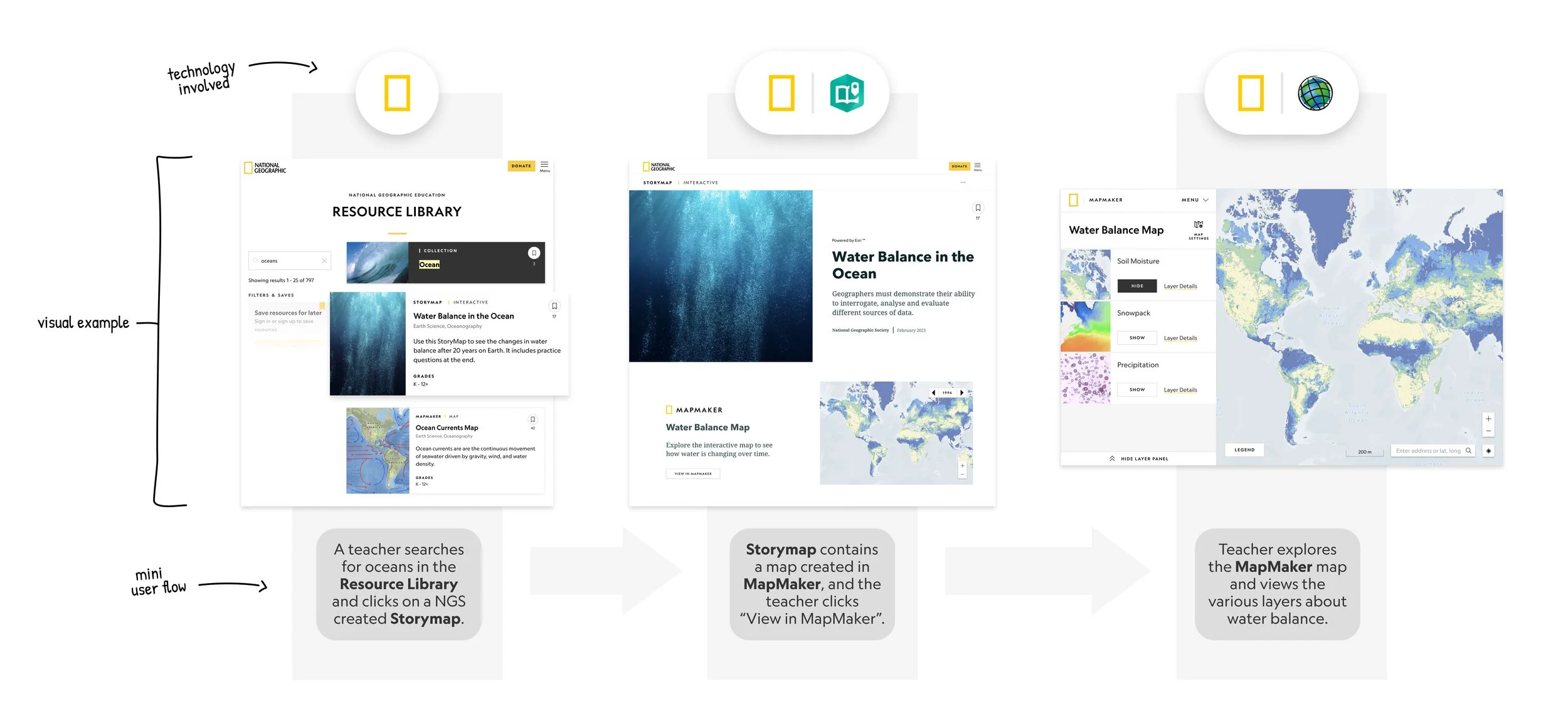
Educators often mentioned that they start exploring our resources in the Resource Library. They described that they often find a promising resource, but wonder how they can use it to build a lesson, or create a more compelling story around it.
To show how Mapmaker could be incorporated into the Resource Library and other tools, I designed a flow to show various discovery points for MapMaker across the NGS ecosystem.
In this example, a teacher is interested in talking more about the ocean in their classroom, which eventually leads them to a curated MapMaker map about Water Balance.
▎T H E F I N A L D E S I G N ▎
Adding Teachable Moments
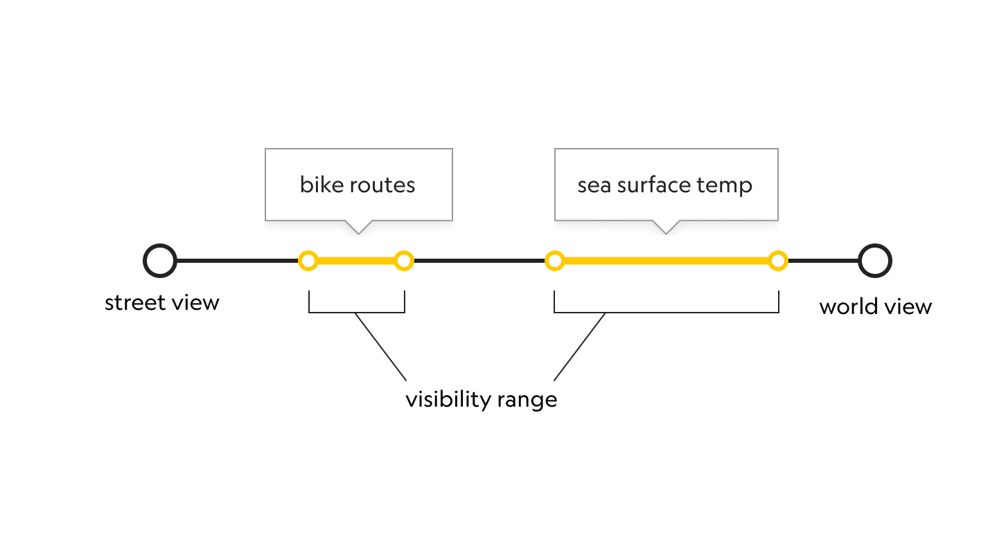
One of MapMaker’s goals is to include opportunities to amplify geographic literacy. To help show how some data is best viewed at certain zoom extents, I designed an alert that appears when a user zooms in too far on the map.

Prototypes created in Figma.
Mobile-First Design
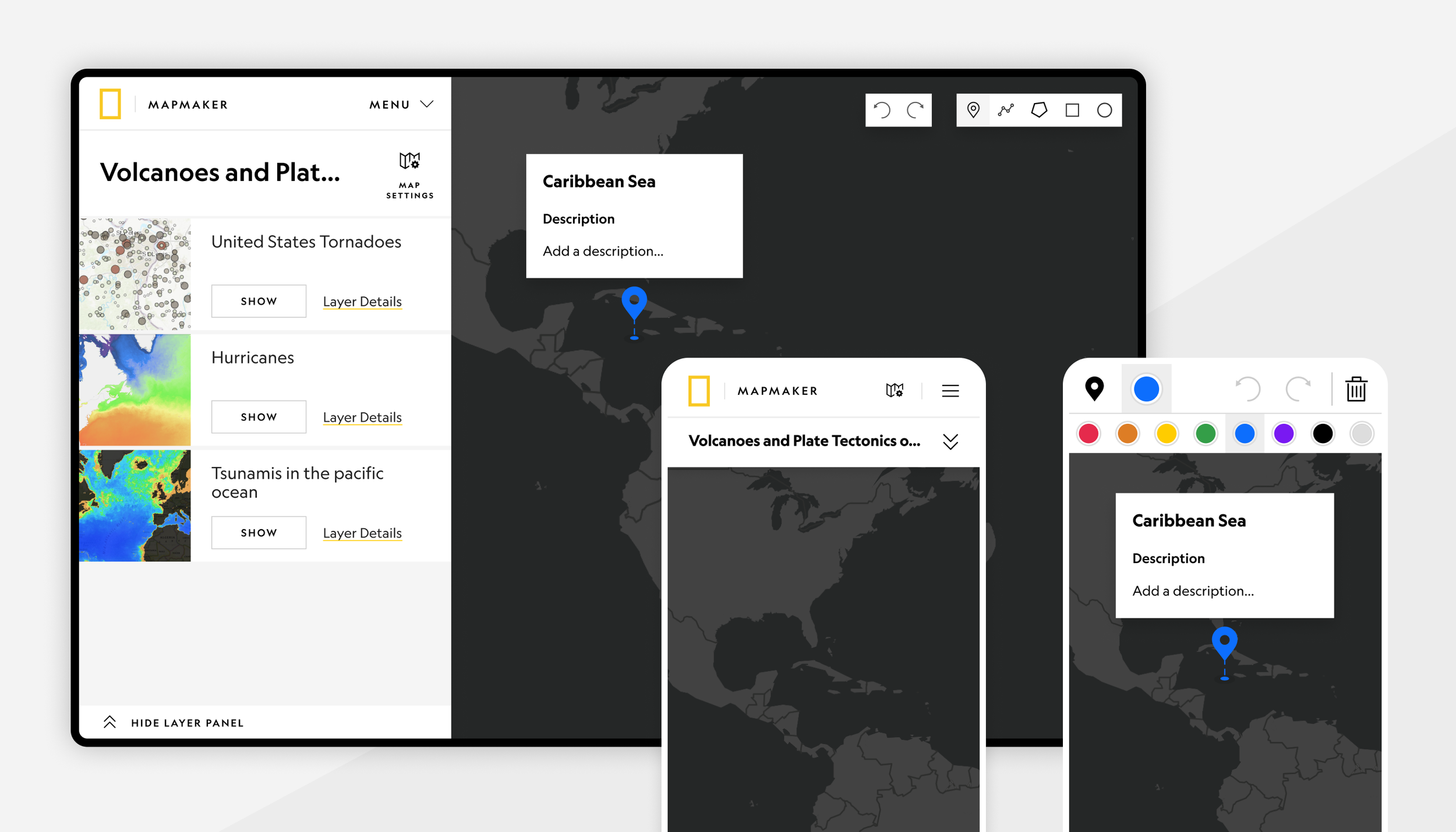
Students use Chromebooks, laptops, and even cell phones during class to get their assignments done. Every feature, function, and tool available on the desktop version is also available on mobile.
*MapMaker is now owned by Esri, and may no longer reflect designs seen in portfolio.
Designing Delightful Moments
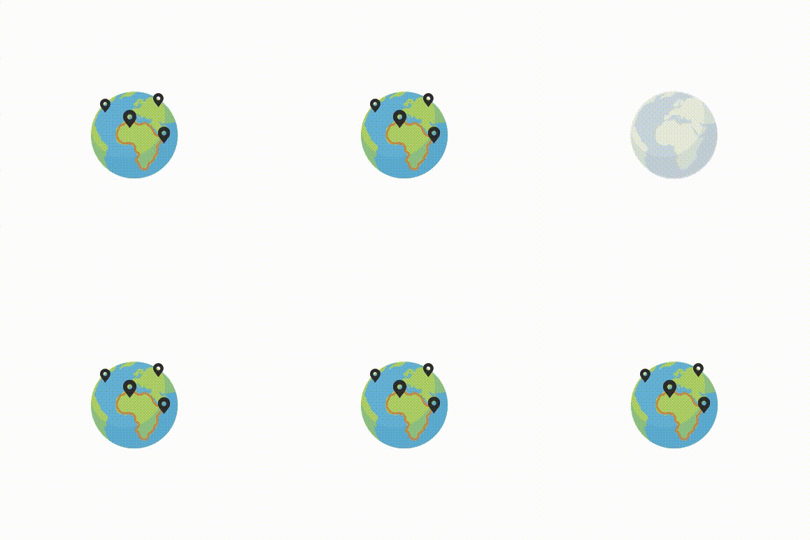
Delightful moments are what make users fall in love with a product. They’re often small enhancements that aren’t essential, but are always nice to have.
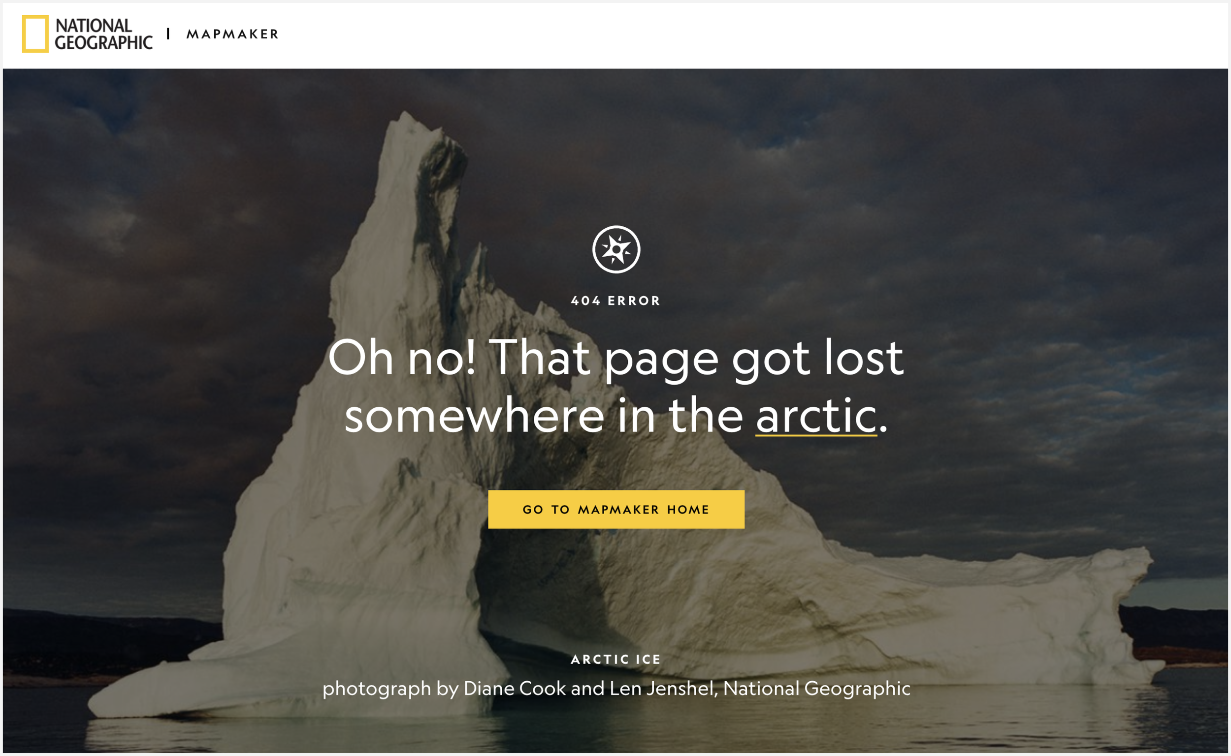
Little moments, like those shown below, are what make a product shine.