Role
UX Designer
Timeline
Sept 2019 – Nov 2019
Client
National Geographic Society
Skillsets
Affinity Diagraming, Contextual Inquiries, User Testing, Prototyping
▎B A C K G R O U N D ▎
The Power of a Map
Maps are an influential instrument of national policy and can be used to effect change and influence opinion. National Geographic produces maps that are translated in over 40 different languages and reach an audience of over 6.5 million people. They are considered an authoritative resource for accurate information about the world.
Because of this, a misprinted map could have lasting and damaging effects.
The Problem
National Geographic staff strive to create maps and content that are factual, apolitical, and reflect current geographic situations. This is a challenging endeavor, considering our political landscape is constantly changing and evolving.
The Solution
A geospatial content management system that provides a comprehensive understanding of new National Geographic map policy changes in real-time.
▎D I S C O V E R Y ▎
Affinity Diagraming
Our first step was to collaborate with stakeholders at National Geographic and hear about their frustrations and goals. Affinity diagramming is a collaborative method to organize large sets of ideas into smaller clusters. We worked with stakeholders to determine the minimum requirements and functionality for the tool.
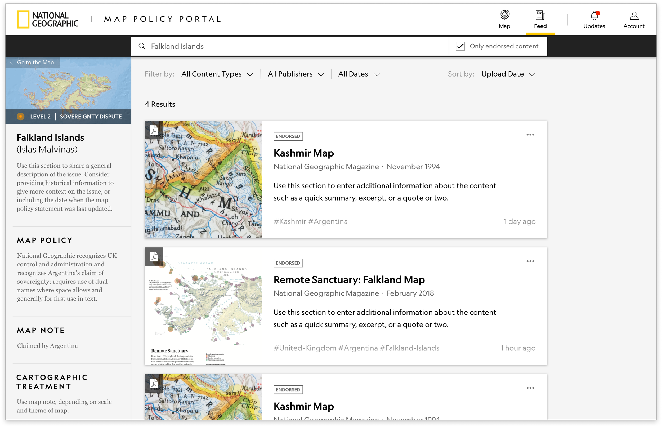
We found that staff members were looking for a tool that allowed them to quickly search for and view the newest map policy issues, and find out which policy issues were the highest priority or had the most sensitive disputes.
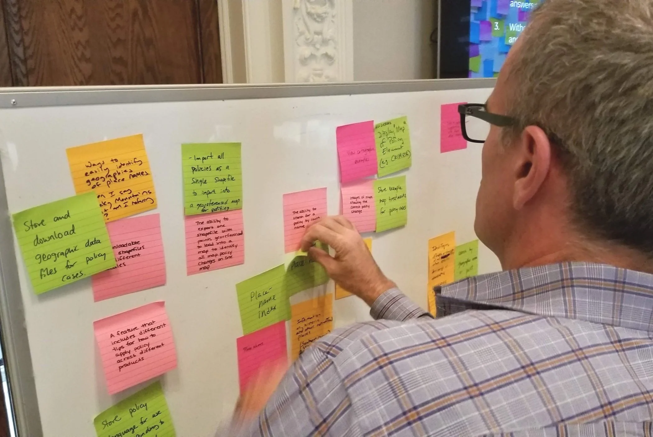
Alex Tait, a geographer at National Geographic, sharing his ideas during the KJ Method.
▎U S E R R E S E A R C H ▎
Contextual Inquiries with Cartographers, Editors, and Article Writers
I reached out to cartographers, writers, and editors at National Geographic to learn more about their day-to-day workflows and to identify what types of policy content they most frequently reference.
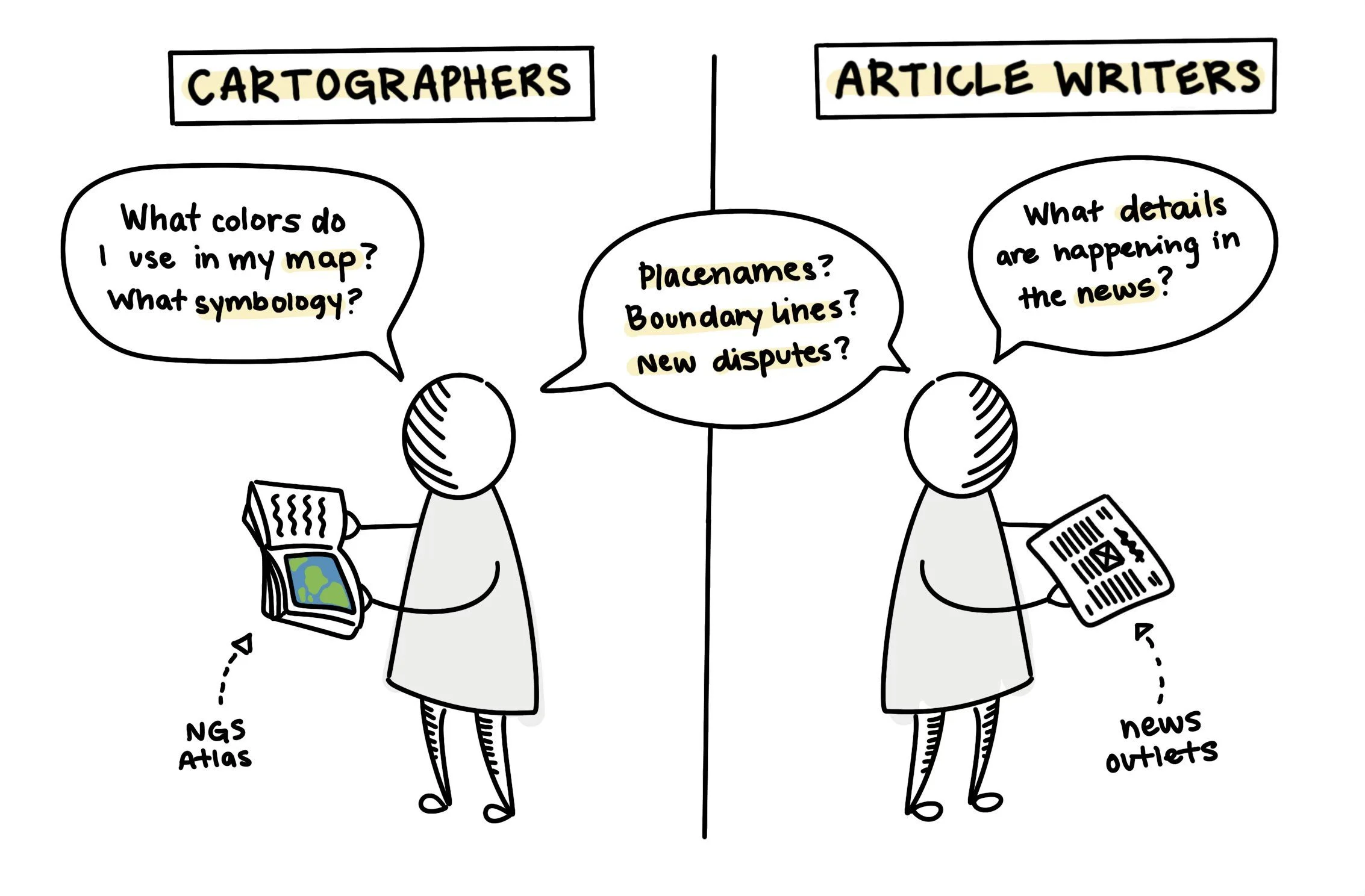
When designing maps, National Geographic cartographers prefer viewing atlas archives or looking to the Board of Geographic Names for clarification on how to update a map. Writers, however, prefer to review editorial artifacts such as legal notices and news updates.
While both groups benefited from seeing and reviewing all types of content during their workday, the unique workflows indicated that a distinctive search and discovery process catered toward each user group could be beneficial.
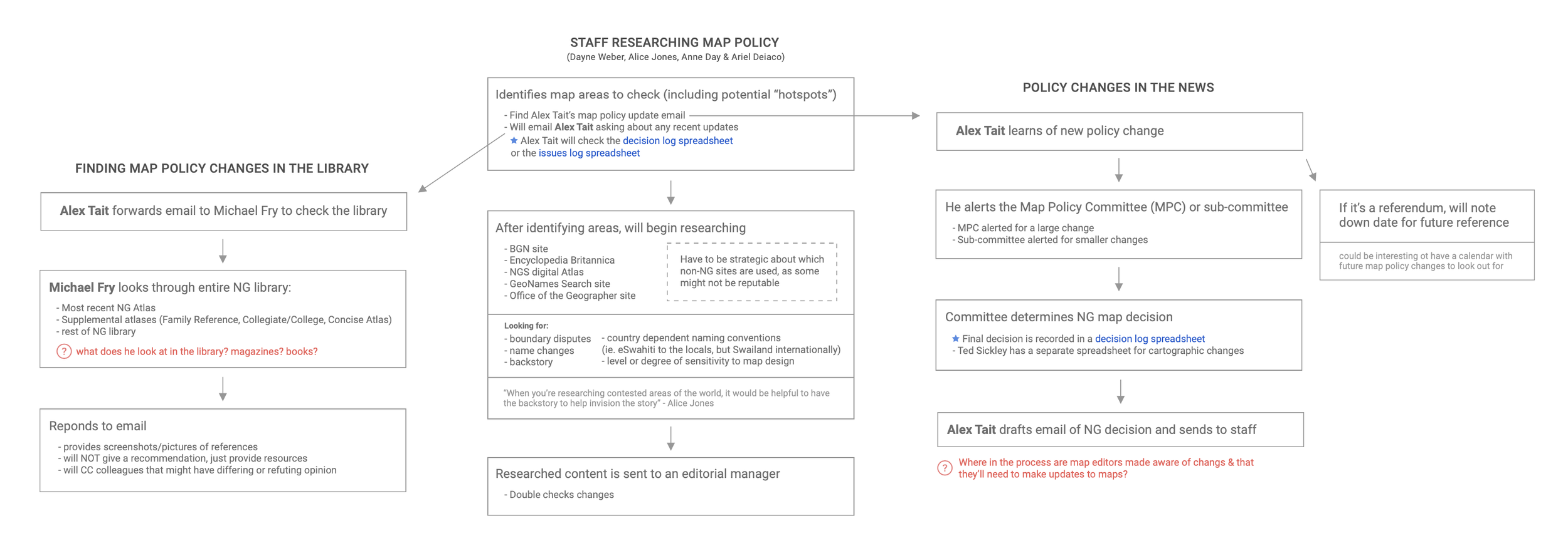
Mapping out the Workflows
Outlining the workflows at a high level helped me see the various ways staff members either discover policy updates their own, or how they’re informed of policy updates from the Map Policy Committee, a group of individuals at NGS who discuss and share map updates. It really shined a light on areas where communication was lost between departments, and opportunities to create a more seamless experience.
▎D E S I G N ▎
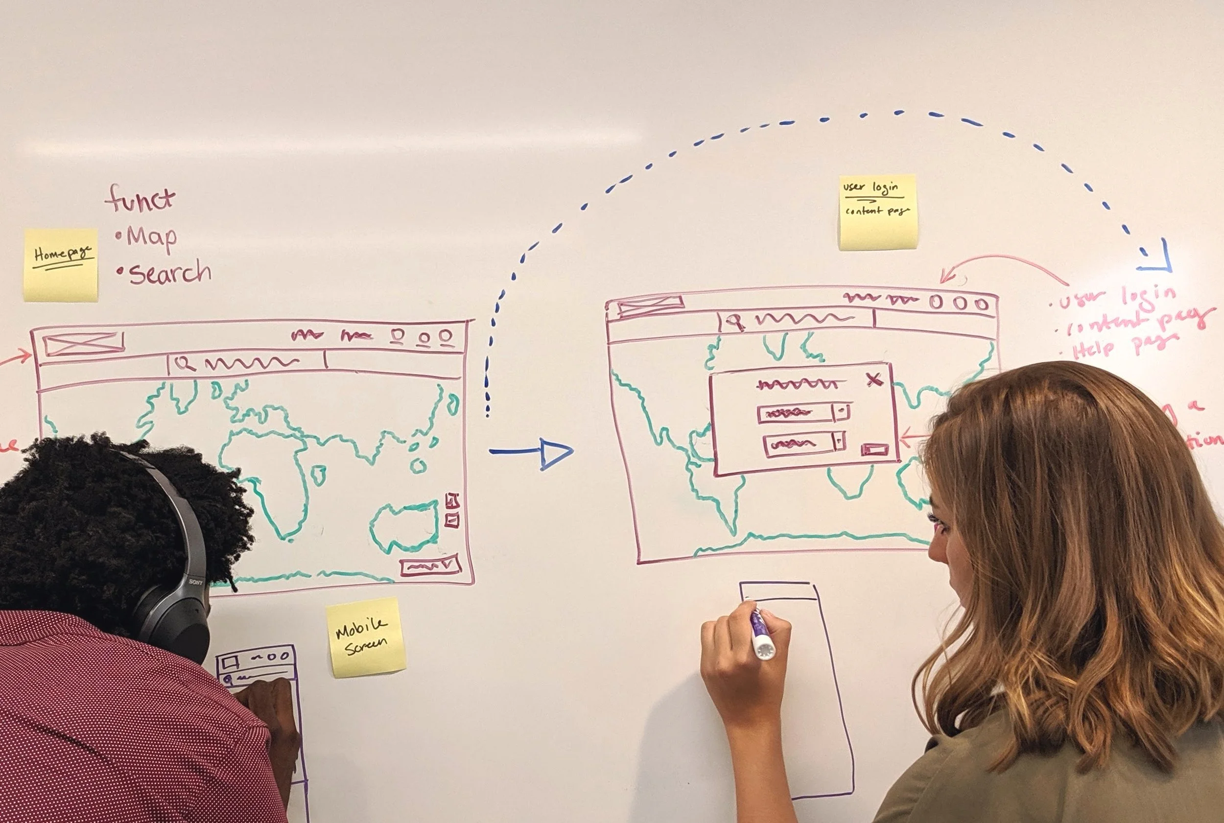
Sketching & Wireframing
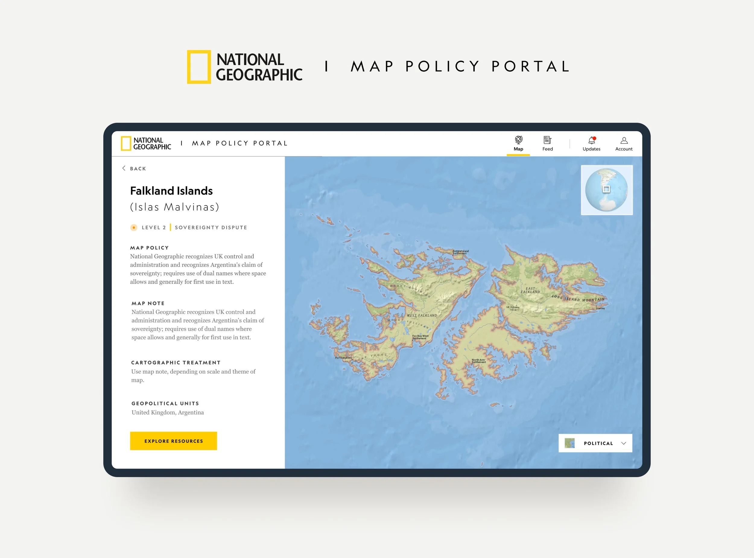
The final solution included two main views – an interactive map and a newsfeed style CMS view to explore content. Each view offers a unique opportunity for users to learn more about map policy. When used together, the combined views create a dynamic and comprehensive experience for discovering current priority issues and reference information.
User Testing
During a few rounds of user testing, researchers and writers mentioned wanting to see results chronologically so they could learn about the progression of a particular policy or location and include that context in their articles.
Another important discovery was how to identify which issues were considered a priority. Which issues were new? Which issues needed special consideration or sensitivity?
I updated the map-view to have graduated points to indicate sensitive disputes and issues.
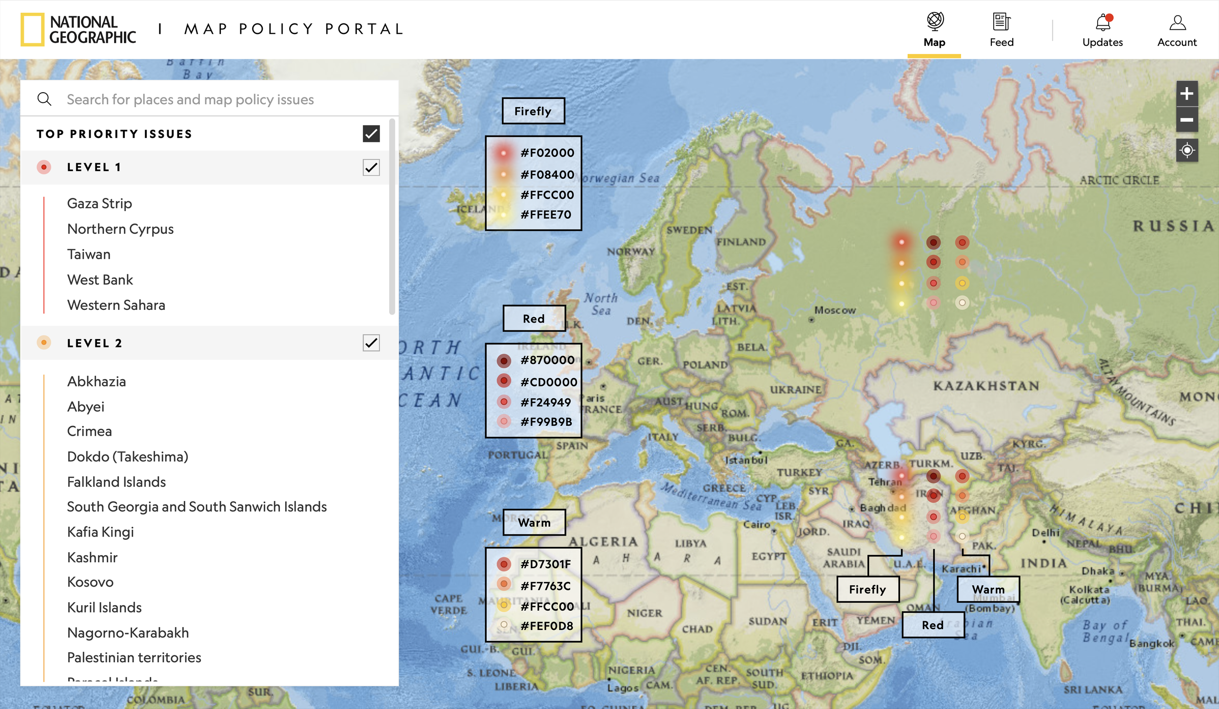
Discovering map policy updates and prioritized issues in real time